Cross-Platform Client UI
The main window of the Cross-Platform Client is also called the project view window because it shows not only a project but a particular view of the project. That view may be the root (or initial) view with which the project was created. The Content Perspective view is the default view that you see when you open the Cross-Platform Client. See the numbered components in the image and refer to the descriptions below.
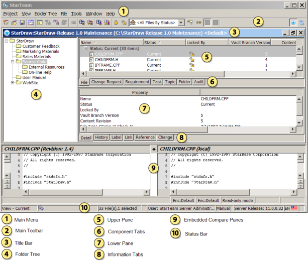
- Main Menu
- The contents of the main menu vary depending upon the selected component. In this example, the File component has focus, so the File menu displays as a selection in the main menu. Possible components include File, Folder, Change Request, Requirement, Task, Topic, and Audit. Menu items that always display in the main menu, regardless of the selected component, include Project, View, Folder Tree, Tools, Window, and Help.
- Toolbar
-
The buttons on the toolbar differ according to the selected component. Frequently used main menu commands have corresponding buttons on the toolbar. Fly-over text displays when you hover your mouse over the toolbar buttons.
At the right of the toolbar are two buttons for switching between two perspective windows of the StarTeam information:
-
 : The standard
Content Perspective which is the perspective you are accustomed to using for Cross-Platform Client.
: The standard
Content Perspective which is the perspective you are accustomed to using for Cross-Platform Client.
-
 : The
Change Perspective which allows you to view and manage all your View Compare/Merge change packages from past VCM sessions.
: The
Change Perspective which allows you to view and manage all your View Compare/Merge change packages from past VCM sessions.
-
- Title Bar
-
The title bar at the top of the main window displays the following information:
- Server configuration that contains the currently displayed project view
- Project name
- View name
- Working folder for the view
- Folder Tree
-
The left pane of the main window displays the folder tree or folder hierarchy. These folders have a one-to-many relationship with the contents of the upper pane because each folder can contain different types of items (for example, files and change requests). Using the Folder Tree in the left pane, you can perform the following operations:
- Display information using icons
-
A folder icon precedes each folder name. Clicking this icon displays folder-associated information in the upper pane. The information displayed depends on the folder and the tab selected on the upper pane.
- Expand and collapse branches
-
You can expand or collapse branches of the folder tree. A plus sign identifies a collapsed branch. Clicking it expands the branch. A minus sign identifies an expanded branch. Clicking it collapses the branch. Alternatively, you can double-click folder names to expand or collapse branches of the folder tree.
You can also move through the folder tree using the Up Arrow, Down Arrow, Left Arrow, and Right Arrow keys. The Right Arrow expands a folder. The Left Arrow collapses a folder.
- Right-click for context menu
-
After selecting a folder from the folder tree, right-click to display a context menu that presents the same choices as the Folder Tree menu.
- Drag items and folders
-
To move a child folder, you can click on it and drag it from one parent folder to another. You can also drag items from the upper pane to the tree in the left pane for the current view or another view (if both are in the same server configuration). To move items from one folder or view to another, select the items, and then drag them from one location to the other.
- Upper Pane
-
The upper pane of the main window contains a tree or list of items associated with the folder that displays in the folder tree. Although each folder can contain items of different types, the upper pane displays only one type of data at a time. The type of data displayed depends upon the component tab selected.
The contents displayed in the upper pane depend upon the following factors:
- The folder selected from the folder tree in the left pane.
- The component tab selected from the upper pane.
- The filter selected from the Filter drop-down list, which displays in the toolbar above the upper pane.
- The
All Descendants
 toolbar button, found in the toolbar above the upper pane. The
All Descendants
command determines the depth for which the client displays information. When not selected, the client displays information
for the selected folder only. When selected, the client displays information for the selected folder, its children, its children’s
children, and so on.
toolbar button, found in the toolbar above the upper pane. The
All Descendants
command determines the depth for which the client displays information. When not selected, the client displays information
for the selected folder only. When selected, the client displays information for the selected folder, its children, its children’s
children, and so on.
- Component Tabs
-
The upper pane of the main window contains component tabs that represent the components that your license provides. Clicking on one of the component tabs in the upper pane brings that component tab into focus.
StarTeam Enterprise Advantage licenses provide all components:
- File
- Change Request
- Requirement
- Task
- Topic
- Folder
- Audit
- Custom: optional tab. Appears only if the administrator creates a custom component.
- Lower Pane and Information Tabs
-
The lower pane of the main window displays information about the item selected on the upper pane. The five information tabs on the lower pane show different types of information. All of the tabs apply to all of the upper pane components except the Audit component. When you select the Audit component, you see only the Detail tab.
- Detail tab
-
The Detail tab lists the information displayed on the upper pane in a horizontal format. For example, if you select a file from the upper pane, the lower pane will show its name, size, status, and so on, depending on the columns that appear in the upper pane.
You can modify the display format and content of the Detail (lower) panes in the StarTeam Cross-Platform Client on a per-workstation basis.
- History tab
-
The History tab lists the past revisions for the selected item. The only exception is a file with the Not In View status, in which case the tab displays nothing at all.
- Label tab
-
The Label tab lists the labels associated with each revision of the selected item. You can use drag-and-drop to move a label from one revision to another.
- Link tab
-
The Link tab shows the items to which the selected item is linked. For example, a file might be linked to a folder, another file, or a change request. Items can also be linked externally from one server to another. The Link tab decorates the external link in the View column with a special external link decoration (
 ), and provides a checkbox which you can use to show or not show external links.
- Reference tab
-
The Reference tab shows the relationships between the selected item and other folders or items with which it is associated. A folder or item may be associated with more than one project, view, or parent folder in the same server configuration because of sharing or because a child view has been created. Each instance of the original folder or item has a reference.
- Change tab
-
The Change tab shows all the actions performed on a process item or workspace (check-in) change package.
- Embedded File Compare/Merge
-
The File Compare/Merge tool is also embedded in the client and when activated, is available for use with the File, History, and Link (if the link is to a file) tabs. You can use this tool in its embedded format to show the differences in the file that you have selected in the upper pane and your local file.
By default, the client does not display the embedded version of File Compare/Merge. You can toggle this feature on and off using the main menu command.
Note: File Compare/Merge also opens in standalone mode. You can open File Compare/Merge using the start menu. - Status Bar
-
By looking at the Status bar at the bottom of the main window, you can determine the following:
- Whether a view is current, rolled back to a label, rolled back to a promotion state, or rolled back to a specific time. If a view is read-only, R/O displays before the configuration information. All rolled back views are read-only because you cannot change the past.
- Whether you have selected an active process item. For example, if you have select a change request for your active process item, the status bar displays the change request title along with its associated number.
- The number of items in the upper pane and the number of items selected.
- Whether you have applied a query to the upper pane.
- Name of the logged-on user.
- The status of StarTeamMPX. A lightning bolt icon represents the status of StarTeamMPX. The lightning bolt changes color or shows a small red "disconnected" symbol in the lower left corner to let you know if StarTeamMPX is available, available but disabled, or available and disconnected. The words Instant, Auto, and Manual provide refresh status information.
- The version of StarTeam Server that the client is accessing.
- The locale and default language of the client.
- Whether you have new (or unread) change requests, requirements, tasks, or topics assigned to you.