Selecting Data for the X-Axis on a Chart

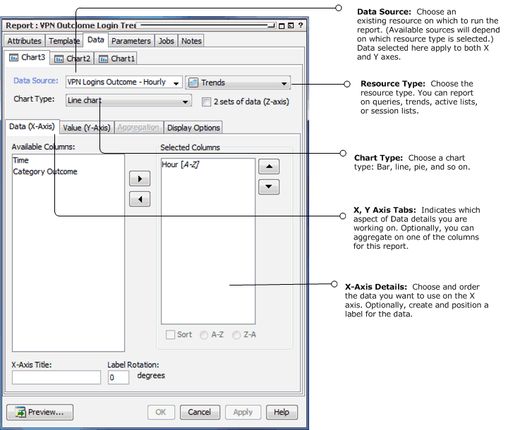
If the report template you selected contains a Chart, bind your result data to the chart as described in the following table.
|
X-Axis Data Attribute |
Description |
|---|---|
|
Available Columns |
Select the data fields from the query you want to show in the X-axis and use the right-hand arrow to move it to the Selected Columns area. The data you select here should be the items you want to count For example, to build a trend report showing number of events over time, use a trend that captures the number of events per day. Add the end time to the X-axis to represent the day and add the count gathered for that day to the Y-axis. In this case, the X-axis is the data label, and the Y-axis is the count. |
|
Selected Columns |
The Selected Columns area shows which data fields you have selected for the X-axis, and provides the opportunity to change the sort order of the data. |
|
Sort |
Sort the selected column in ascending or descending order. To change the sort order, select the column then click the Sort check box. Select A-Z to sort data in ascending order; select Z-A to sort data in descending order. Note: If you are also plotting a Z-axis (data series) and your output is a bar chart, make sure to set your sorting on the X-axis. |
|
X-Axis Title |
Specify a title for the X-axis. |
|
Label Rotation |
Select a rotation angle for the by entering a digit between 0 and 90. Labels refer to the individual X-axis data points, which are automatically derived from the data. The Label Rotation controls the angle of these labels. |