Binding Data to Charts
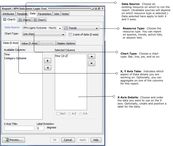
The Data tab is where you choose which parts of the query or filter result data you want to use for each report element, apply legends and, optionally, top/bottom functions.
Use these options to select the data source (query or trend), chart and table type to use for the report, columns to include, and details on how the chart presents data.
|
Chart Data |
Description |
|---|---|
|
Data Source |
From the drop-down menu, select an existing data source you want to use for the chart in your report. The data source drop-down menu provides a list of existing resources based on the resource type you selected in the accompanying drop-down. You can report on queries, trends, active lists, or session lists. When the data source is selected, the remaining elements of the Data tab populate with the data available in the selected resource. |
|
Chart Type |
From the drop-down menu, select the type of chart you want to use for the chart part of the report. Depending on the template you use, you may have are several types of bar charts available as well as line charts, pie charts, speedometer, and so forth. The data source and chart type you choose apply to both the X- and Y- axes. |
|
Check this box if you want to plot the same type of data in a series fashion, for example, hourly EPS rates for connectors and different connectors comprise the series. Note: If you check this box, the Data tab adds a subtab for the Z-axis. |
Selecting Data for the X-Axis on a Chart

If the report template you selected contains a Chart, bind your result data to the chart as described in the following table.
|
X-Axis Data Attribute |
Description |
|---|---|
|
Available Columns |
Select the data fields from the query you want to show in the X-axis and use the right-hand arrow to move it to the Selected Columns area. The data you select here should be the items you want to count For example, to build a trend report showing number of events over time, use a trend that captures the number of events per day. Add the end time to the X-axis to represent the day and add the count gathered for that day to the Y-axis. In this case, the X-axis is the data label, and the Y-axis is the count. |
|
Selected Columns |
The Selected Columns area shows which data fields you have selected for the X-axis, and provides the opportunity to change the sort order of the data. |
|
Sort |
Sort the selected column in ascending or descending order. To change the sort order, select the column then click the Sort check box. Select A-Z to sort data in ascending order; select Z-A to sort data in descending order. Note: If you are also plotting a Z-axis (data series) and your output is a bar chart, make sure to set your sorting on the X-axis. |
|
X-Axis Title |
Specify a title for the X-axis. |
|
Label Rotation |
Select a rotation angle for the by entering a digit between 0 and 90. Labels refer to the individual X-axis data points, which are automatically derived from the data. The Label Rotation controls the angle of these labels. |