Selecting Data for the Z-Axis on a Chart (Optional)
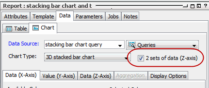
If you want to plot data in a series fashion, check the 2 sets of data (z-axis) checkbox in the Data tab. This makes the Z-Axis subtab available, where you can select a column for your Z-Axis.
Tip: Best practices when using series (Z-axis):
If you are setting data on the Z-axis, note that you cannot use Top N Charts. Also consider the effect of the Row Limit setting in the query. For example, if your row limit for a normal chart (X- and Y-axes only) is 10 rows, you will get 10 data points.
For a stacked chart with Z-axis, you will still get 10 data points but two will be in the same column. You can try a limit of 25 to 30 rows, which makes the chart readable, but could cause a readability issue if there is not a lot of overlap (stacking) in the data series.
Effect of Sorting on Bar Charts with Series Data
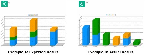
You might encounter unexpected results in your bar charts (stacked or not stacked) if you are plotting data on the X-, Y-, and Z-axis. Consider the following stacked bar charts, where the expected result is shown in Example A but the actual result shows as Example B. In Example B, the stacks seem to spread out along the X-axis as separate data points (the samples are only to represent the behavior described in this topic).

The following configurations can result in a stacked chart report similar to Example B:
-
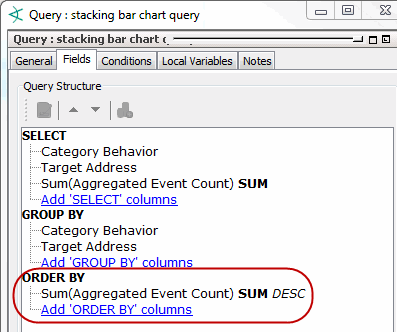
The query has an ORDER BY statement:

The query is not wrong; in fact, the report rendered as a table shows correctly. Additionally, the query may be driving other resources like query viewers and so on; therefore, you should not change the query in this case.
-
The chart is configured for z-series data plotting:

Again, there is nothing wrong with this setting if you want to plot a data series.
-
The column included in the ORDER BY statement from the query is applied to the Y-axis and sorting is also enabled:

Using the query’s ORDER BY column on the Y-axis and also applying the sorting to the Y-axis gives you the Example B report, the one you did not expect. To fix this problem, configure the report so that sorting is ignored on the Y-axis. Instead, apply sorting to the X-axis according to the following instructions.
To configure the report so that it sorts on the X axis:
-
Go to the chart’s setting for the X-axis parameters and click the entry under Selected Columns.
-
Click the Sort checkbox and select the sort order as desired.

You do not need to remove sorting on the Y-axis as long as sorting is enabled for the X-axis. The X-axis takes precedence, and the resulting report will now be like Example A.