Viewing Query Viewer Results
Where: Navigator > Resources > Query Viewers
To view query viewer results in the default view:
Double-click a query viewer.
The query runs, and returns results in the Viewer on the current state of the network and event flow.
Alternatively, you can add the result of a query viewer directly to a dashboard. For information on this, see Adding Query Viewers to Dashboards.
To view query viewer results in different formats:
-
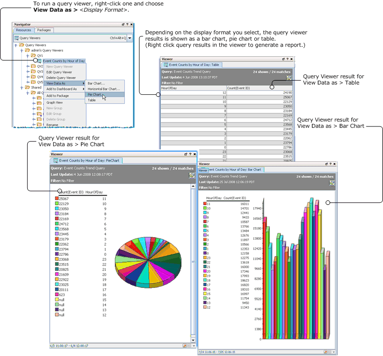
Right-click the query viewer and select View Data as > <Display Format> then choose one of these options:
Display Formats of Query Results Format
Description
Bar Chart
Display query results as a bar chart.
Horizontal Bar Chart
Display query results as a horizontal bar chart.
Pie Chart
Display query results as a pie chart.
Table
Display query results in table format.
Note: Baselines can only be applied to or viewed for query results shown in table format. (For more about establishing and using baselines, see Defining and Using Baselines.)
Note: By default, chart-style views (Pie and Bar charts) are limited to a maximum of 20 results. Table views can retrieve up to 10,000 rows of data, so it is possible the results in chart views and table views for the same query viewer might not match.
To allow for more results in a chart view, select the Use classic charts option in Global Preferences. By default, classic charts display a maximum of 99 results. To increase that number, add the following property to the console.properties file and specify the desired value:
queryviewer.max.dashboard.chart.rows
For information about editing the console.properties file, see the ESM Administrator Guide.
-
If you select a Table display format, the results are displayed instantly.
-
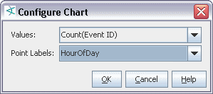
If you select a bar chart or pie chart, you are asked to configure the chart display in the Configure Chart dialog.

Field
Description
Values
The Values drop-down menu lists fields in the query result that contain data types. The value you choose is used as the numbers by which to plot the vertical y axis points on a bar chart or the slice sizes on a pie chart.
Values typically represent an unknown set of values, like a count. A common example of numeric data appropriate for values is a time like
HourOfDayor a count likeCount(Event ID).Point Labels
The Point Labels drop-down menu provides fields in the query result that contain non-numeric data types. The point labels are used to plot the horizontal x axis labels on a bar chart or the slice labels on a pie chart
Examples of non-numeric data types appropriate for point labels are timestamps, strings such as are used for event names, and different types of addresses such as IP or MAC addresses. Point labels are typically a known set of limited values (like hours in a day denoted by timestamps).
- Select fields for Values and Point Labels.
Details on how to read and manipulate query results for each of these formats are provided.
Example view settings:
For example, for the Event Counts by Hour of Day query viewer, selecting Count(Event ID) for Values (the y axis) and Hour of Day (or Timestamp) for Point Labels (the x axis) results in the following display showing the event count for each hour of the day. The event count is depicted on the vertical y axis, with higher bars representing a higher event count for that hour. The hour of day (time) is represented on the horizontal x axis. The event count is shown for the last 24 hours starting at 11 am.

Understanding the results view:
The results are displayed in the Viewer. The following example shows the “Event Counts By Hour of Day” query result as table, bar chart, pie chart.

Notice that the time range for the base query is shown on the lower left of the query viewer results. Hover the cursor over the time range to see an annotated view of start and end times (data collection start time and data last received). This time range comes from the base query. (Another way to see the query time range is to open the query viewer in the editor and double-click *Query in the Attributes display to drill down to the base query editor, which shows query start and end times.)
Following is the Time Range of Base Query:
